I feel like having a party

For some reason, I got home from teaching today and I felt like dressing up and having an afternoon party. I don’t know if it’s the warm weather, my excitement over my party clothes shipment from Asos.com or the fact that I am looking forward to baking 30 lemon cupcakes for the weekend.  Something says it is time to entertain.  In my fantasy entertaining world, if I was to dream up my afternoon party I would make sure to fill my table and home with the following items.

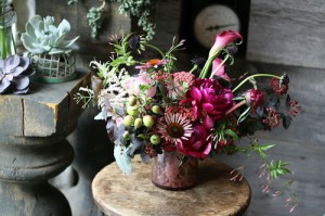
1. Flowers from Saipua in Brooklyn.  I like how the fuscia stands out from the pack.

via saipua

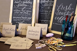
2. Invitations, hand done by Plurabelle Calligraphy. I like the look of the calligraphy on the chalk boards below.

via plurabelle calligraphy

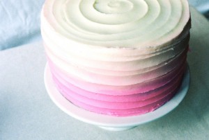
3. This ombre cake by Apt2B Baking Co. first because I love ombre, second because the cake is almond, another fav.

via apt 2b baking co

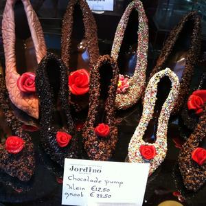
4. Chocolate pumps for my guests from Jordino in Amsterdam. I swear these things call out to you when you walk by the window.  I want to crunch on a chocolate shoe with sprinkles.

via foursquare

5. Finally, a fun mix of colourful and interesting table top items to accessorise the food and drink. Yes, I threw in two bright clutches, not as a table top accessory but more as a thought of what my guests would be holding to brighten up their outfits.

 

Party time


| 1 comment

Rubber Stamps

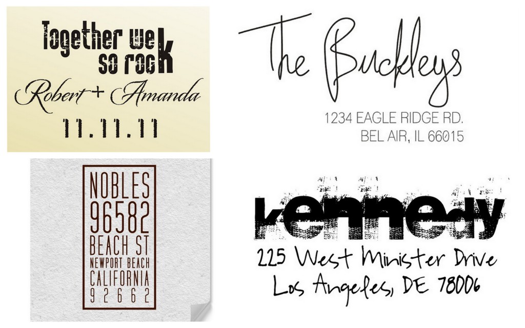
I am in the market for some rubber stamps to use with my wedding invitations but don’t know which to choose! There are so many exciting designs, shapes, patterns and colours, I am not sure how I am going to make a choice.

I love that stamps have gotten so creative.  There are as many stamps as stationery choices.  Mind boggling really.  Fortunately Etsy makes it super easy to find someone to work with!!


Photos via Etsy 1, 2, 3, 4

| 1 comment

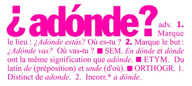
adonde

Where are you? Where are you going? If you have ever studied Spanish in your lifetime, you are probably familiar with this word and its definition.  But, are you familiar with the ecologically minded, French design brand that goes by the same name?

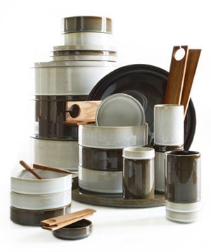
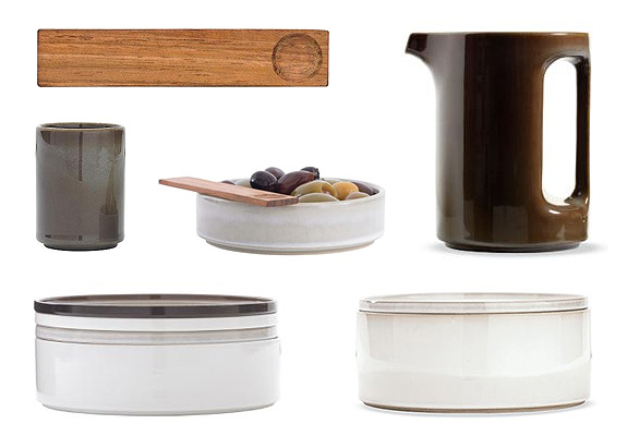
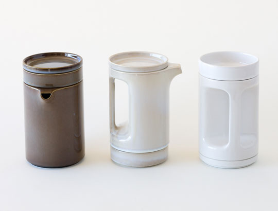
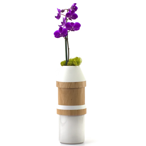
The two designers behind adonde, Laurent Serin and Javier Gutierrez Carcache,  have created an impressive, natural, recyclable, locally produced, minimalist line of modular tabletop items that are both functional and stylish.  I found a nice quote on a European Consumer Choice website that gave this brand high marks for its products.  The quote was from one of the company’s designers who stated, “When an object is beautiful and useful, you don’t put it away.” I can’t agree more.

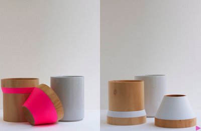
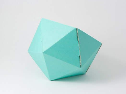
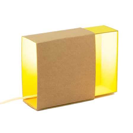
Adonde’s items are the type of things you would proudly display on your kitchen counter, table or shelf, not to be concealed behind doors.  While not massive, their product range is large enough to satisfy any entertaining needs.  Could you image having a set of 12 of their dishes?  They would look stunning against a rustic wood table.  Their colourful cardboard based organizational products are also neat.  They come in different geometric forms and you can store anything from paperclips, pens, pencils, markers, stickers and glue.  However, I am personally a big fan of their flower vases and teapots (see below).

If you are interested in learning more about the company, they have an excellent flickr stream and of course you can connect with them on their website. (Forgive my lack of question marks, especially the upside down question marks at the beginning of the word- I can’t make it happen on my keyboard!).


via apartment therapy


via fokal


via happy mundane


via wallpaper


via fitzsu

via pushing papers

via le blog desptisloulous


| 0 comments

Fun Items for a Tabletop

Here are my favourite items for a tabletop right now!  I think they should all be in my house, on reserve so I can access them at whim and decorate!!  Happy Thursday. The sun is shining and I am about to hit the road for Berlin.


Source: neest.fr via Sarah on Pinterest

Source: luxefinds.com via Sarah on Pinterest

| 0 comments

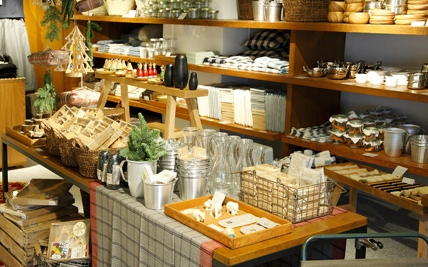
Found Muji

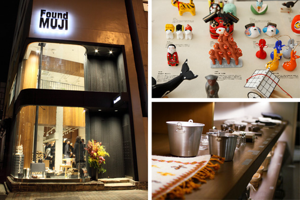
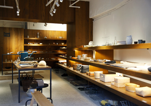
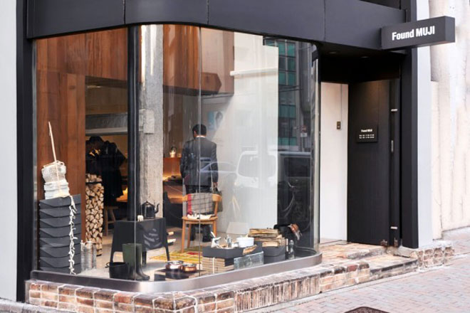
Have you heard the news? Muji, the Japanese home goods brand that continues to expand around the globe and entice customers with its simple, everyday products, recently re-branded and re-launched the location of its first ever Muji store in Tokyo’s Aoyama district and called it Found Muji.  Every time I am in a city and see a Muji store I stock up on cute little items, especially their pens.  When I was living in Hong Kong in 2003 and again in 2006 I couldn’t get enough of their colourful pens and office organization items and simple brown paper notebooks.

For those of you Mujites who love the brand’s minimalist, affordable products, natural style, and endless hours of in-store fun, Found Muji looks to be even cooler.  I love what they did with the concept behind the new store.  Instead of showcasing their own Muji brand, they are selling the goods produced by small businesses and revealing the stories behind each of the products they’ve selected for the Aoyama store. Now that I think about it, Found Muji actually reminds me of ABC Carpet Factory in New York, of course with an entirely different aesthetic-

Maybe this will be a concept that expand globally.  What a treat if they do!

via Tmagazine


via 2121 design insight


via huh magazine


via muji


via muji

| 2 comments

design friendly jam

I spent most of the day preparing a Power Point deck for my lecture tomorrow and funny enough, I got an idea for my blog post as a result of my research for class.  I am big fan of the package blogs, The Dieline and Lovely Package and have featured product designs from both sites, on my blog over the past couple of years.  Today, I was hunting down examples to illustrate the concept of positioning in marketing and decided to focus on jam brands.

What I learned is that jam is a tricky item to position and requires extra creativity to carve out a niche in the mind of the consumer.  I think at one point in time, positioning jam based on a comparison such as, made with 100% fruit and no sugar added versus the alternative (less than 100% real fruit with additives) used to be a differentiating factor for a new entrant.  A company could enter the market with a new jam and have a home in the customer’s mind with its 100% fruit product.   However, after digging around for examples, I discovered a lot of  jams were 100% fruit with no sugar added, which crossed out that idea for positioning.  So I had to come up with another set of criteria.  Chunks versus no chunks? Organic versus non-organic?  I decided to use design as a position, why not? I blog about it anyway.

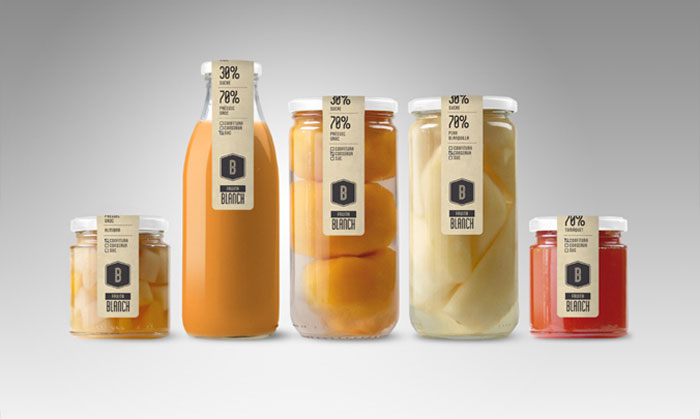
Here is a round of my design friendly jam that I am sure tastes good (as it is 100% fruit, no sugar added) but looks fantastic due to the talented package designers behind the label.

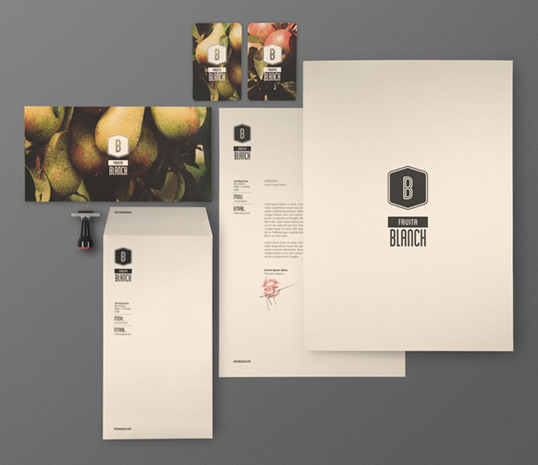
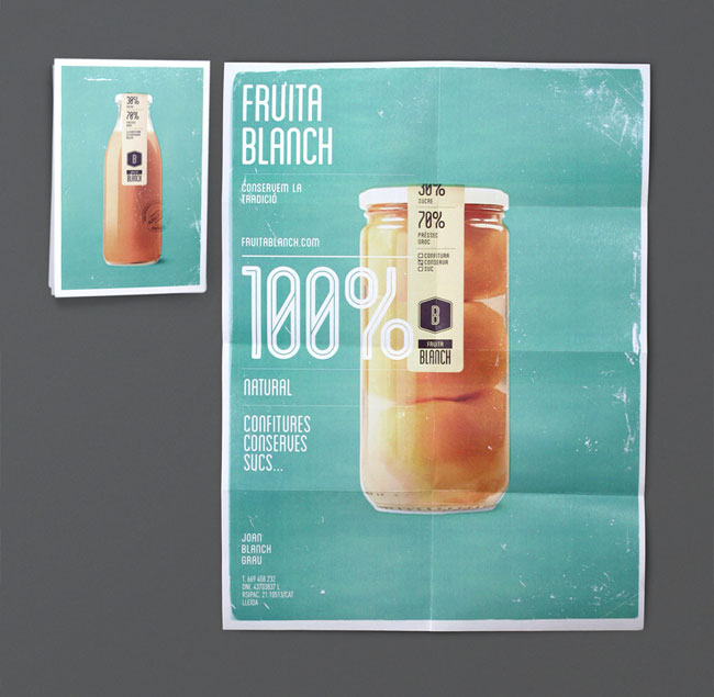
1. Fruita Blanch from Spain- These guys are so popular from a design perspective they have their own stationery and font.  I wonder what the price tag is on a jar of their jam?

via dtail.com

via lovely stationery


via carrieanndesign

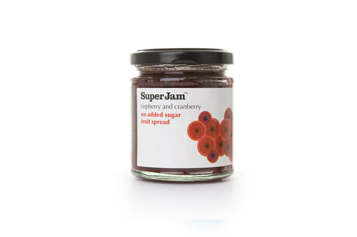
2. SuperJam from Scotland- Simple packaging, bold font and bright colours stand out.

via inspiring young people

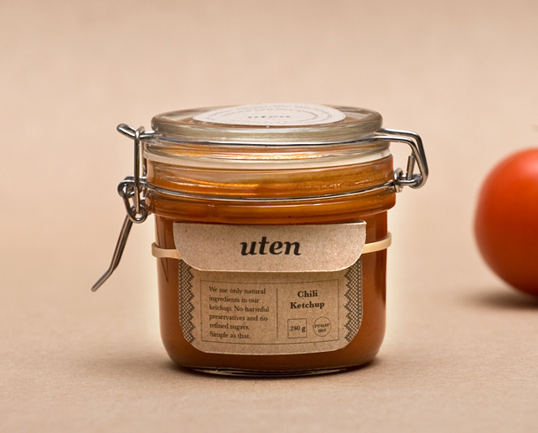
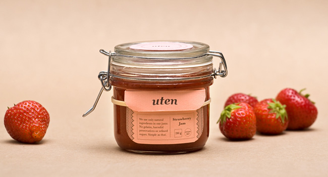
3. Uten- Norway – Natural and homemade looking and a reusable jar with a label attached with a string so you can make your own once you’ve finished theirs. Cool angle.

via lovely package


via packaging of the world

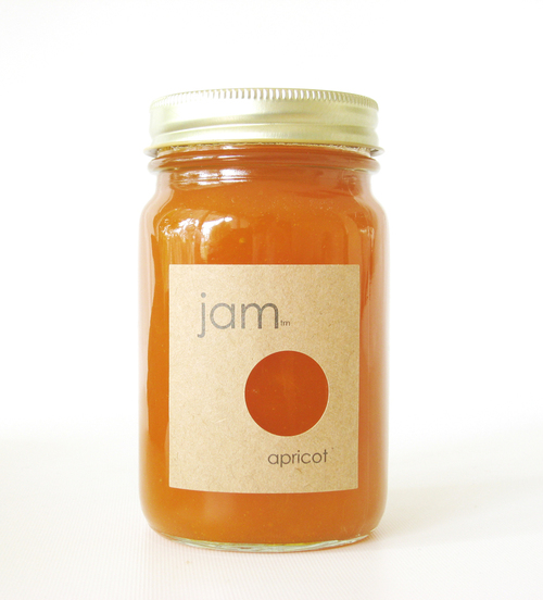
4. We Love Jam from California- Minimalist jam.  Love it!!

via popsop


via daily candy

Related Posts Plugin for WordPress, Blogger...
| 0 comments