T2 or tea too

Any tea shop that sports a chandelier out of Turkish tea glasses, and has the ceiling height to do so is a tea shop I want to visit.

T2 or tea too, started by Maryanne Shearer in 1996 in the Fitzroy suburb in Melbourne, Australia, has done a phenomenal job filling the world with more tea, or more specifically, filling Australia with more tea.  T2 currently has a network of 30 retail stores around the country and is a fabulous example of a design inspired travel destination.

Photo Sources: 1, 2, 3, 4

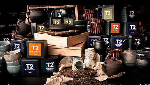
I love T2’s dark, modern, sleek and spacious store interior that is filled to the brim with colourful fun things to smell, see, touch and taste.  T2 carries approximately 200 teas from Asia and Europe and has a wide array of fun tea accessories from tea cups, mugs, jugs, pots, saucers and more.

There is something very attractive about the masculine looking nature of the store interior, coupled with the brand’s bright colour palette (black, red, orange, pink) accented with Asian aesthetics and patchwork on the website-T2’s look is a stark departure from the image of a typical tea shop that one would conjure up and I think it is fabulous.  I can’t wait to visit when I eventually make my way over to Australia.  Has anyone visited a T2 shop before?  Would love to hear about it.

T2, T2 tea

| 0 comments

Katrin Moye

I have a philosophy about tabletop items.  My philosophy is that people develop an emotional relationship with the stuff (tabletop items) they use and the items with the strongest emotional connection get used the most.  Think about the items in your home that you may be “afraid” to use because of how breakable it is, or it has been categorized as a special occasion only item because it is fragile.  UK based artist, Katrin Moye has a down to earth perspective on tabletop items and why she got into ceramics: she wanted to create pieces that people were not anxious about handling.    Just look how sturdy her mugs, dishes and jugs look.  I love the items from her dotted stripe collection as well as her tiny hoops and dandelions collection.

Photo Sources: 1, 2, 3, 4, 5 

| 0 comments

Räder Poetry et Table. Breakfast

I am a big fan of breakfast sets (dishes, plates, cups and bottles), so I have to share my new find this weekend; An adorable line of breakfast-ware titled “Poetry et Table. Breakfast” from German design company, Räder (Hartmut Wheels).  I have never heard of this brand before but was immediately drawn to its  in-store display which had a beautiful breakfast scene set up on a large wooden table, accessorized with Räder’s breakfast accessories (similar to the photo below- minus the food).


I love the simplistic design of each of the ceramic pieces and how the design integrates graphics of chickens,  cows and pigs in an artistic and modern way.  I don’t speak German so I can’t translate what is written on the items but I would imagine it has to do with the company’s sweet, “poetic” product description on their website which reads:

“All in butter. The day begins. The eggs cook. Life is’ today ‘higgledy-piggledy. The grapefruit is sour again. But where the milk to the coffee kisses, because the joy of sitting at the table. Take newspapers, bread and a poached egg. And Sundays sometimes two.”

Photo Sources: 1, 2, 3, 4, 5, 6, 7, 8, 9, 10, 11


| 0 comments

Unlimited Editions Prints + Letterpress

Today’s post is dedicated to a very cool annual art festival that kicks off this weekend (for the entire month of May) in Brighton (UK), called the Artists Open Houses.  One of my favourite studios that is a participant in the Artists Open Houses event, and which has curated an impressive collection of typography, prints and letterpress pieces, is called Unlimited Editions.

Unlimited Editions it a true treasure trove for all things typography and print related.  If you can’t hop on a plane to visit their studio and store in Brighton, they do ship most items around the globe.  I am in love with their linen backed London route master bus destination blinds (unfortunately these signs are not for shipping and you do need to get to Brighton to make this purchase).

London Routemaster bus blinds

Julia Trigg‘s Signals- 1935 typographic ephemera print:

Signals - 1935

Lina Meier Studio‘s Vers Libre candle holders:

Vers Libre candle holders

And….. of course prints by Unlimited (the husband and wife team behind the store/design studio)

Brighton Fontmap - red on white

Photo Sources: 1-6, 7, 8, 9, 10 

Which print do you like?  Is anyone attending the Brighton Artists Open Houses this year? Be sure to leave me a comment below.  I would love to hear from you.  Have a nice weekend.

| 1 comment

Love This: Pinterest Selection

Yay!!  The weekend is almost here.

I am looking forward to it.  Here is a round up of photos I am loving from Pinterest that I thought you might enjoy.  I am particularly fond of the pie chart chocolate and green tea tins.  I wish I had them both in my house now.  How adorable are they?


Source: swiss-miss.com via Sarah on Pinterest

Source: shopbando.com via Sarah on Pinterest

Source: thedieline.com via Sarah on Pinterest

Source: thedieline.com via Sarah on Pinterest

Related Posts Plugin for WordPress, Blogger...
| 0 comments